Lavina Marie. Powered by Blogger.

Pages

  • Home
  • Contact
  • Artist
  • Press

BTemplates.com

Follow Pencil Paint

The Art of Lavina Marie

Acuzar by Lavina Marie Verdolaga
Acuzar
Watercolor on paper

I thought I'd give painting houses a try, just to play around with different painting techniques. This is a relatively small painting, referenced off a photo I took of an old house at Las Casas Filipinas de Acuzar (read the post here). It was quite perfect for practicing painting shadows and foliage. 

I had no idea what I was doing half the time, but I loved every minute of it. I think I'll do more houses in the future. :) 
Share
Tweet
Pin
Share
2 comments
I had my doubts as to whether I could teach basic watercolor painting - major doubts; I was a nervous wreck during my preparations - but my watercolor workshop turned out even better than I had dared hope.

Clockwise from left: Lian, Alan, my Tita Gina, Patt, and Ray
Only five of the fifteen slots were filled, which actually made things a whole lot more fun and manageable. I was able to work with the participants coolly, if not comfortably; although I did feel like quite the noob the whole time, haha. They were all just so quiet, too quiet, in fact, that I thought I was virtually boring the creativity out of them. But I was incredibly happy to see them paint like seasoned wizards:

Patt working on her tones
Ray trying out the wet-on-wet technique
Their level of skill surprised me to no end, especially during the practical application of landscape and still life painting. But it's a wonderful - albeit unnerving - feeling, really, to see others apply the knowledge that you imparted to them.


I can see how teaching can be a fulfilling profession, but I really don't think I'm cut out for it. Still though, I'd love to conduct a workshop again, and I hope I can in the future. Thank you Times Trading Inc., for giving me this wonderful opportunity. ♥

Group picture! (Sorry for the yellowish hue)
Have a wonderful February ahead, everyone! :)
Share
Tweet
Pin
Share
No comments
Hello everyone! This may seem rather sudden, but I'll be conducting a basic watercolor workshop this month and next:


The workshop will facilitate the instruction and use of Derwent Inktense Blocks in basic watercolor painting. I'll be teaching participants to know and understand colors and tones, as well as to paint subjects hands-on using techniques and exercises that are fundamental for effective watercolor painting. It's gonna be fun! :D

There will be two batches for the workshop, one on January 26, the second on February 23 (both Saturdays). There are only 15 slots available for each batch, so if you wish to make a reservation, please do so now (deadline is January 18)! Materials and handouts will be provided. If you have any questions, please contact me here, or else inquire through the number and email provided in the poster. Thank you, and I hope to see you there! ♥
Share
Tweet
Pin
Share
No comments

L-R: 'Hunger' by Carle Griffiths, 'Nostalgia Pink' by Mandy Lynne, 'Blush' by Valerie Chua
(Photos from Etsy.com)


'A Heart's Dance' by Lavina Marie Verdolaga
A Heart's Dance
Watercolor and ink on cotton rag
14.8 x 21.0 cm

Postcard art has and continues to be one of the more effective means of marketing one's art to prospective buyers. It's a trend that I've always admired (just look at those lovely postcards up there), but I've never seriously considered joining the bandwagon myself... until I began working on this particular ink and watercolor piece: A Heart's Dance.

I find none of my previous paintings worthy of being on a postcard, but for some reason, this particular ink painting breaks the mold; I think it's the Rackham-cum-Goble style that does it, along with the size and texture of the paper I used for it, that makes it seem perfect for a postcard series featuring storybook-like illustrations. 

I know I've had several of these 'great ideas' in the past which never really took off, like my One Thing Challenge and my Flories series, but I'm really liking the idea of creating postcard art. It'll be a fun project to work on for this year, I believe, as each painting will be small and thus easier to finish, but detailed enough to warrant at least a considerable amount of my attention.

I'm not sure yet if I'll sell the postcards; heck, I don't even know how to go about printing them, haha! My friend Kai Jimenez and I have yet to scour the streets of Manila for a good printer; we've decided to team up for this postcard project - my paintings and her photographs (check out her beautifully introspective work here) - to fulfill one of our mutual personal aspirations. So, if you have any suggestions, we'd love to hear them!

Share
Tweet
Pin
Share
No comments
Merry Christmas, everyone! :D I hope you and your families are blessed with love and happiness this season. I've been working on a piece and review for some time now, and I can finally share it with you, and in time for Christmas Day too, haha!
'Dewfairies at Work' by Lavina Marie Verdolaga
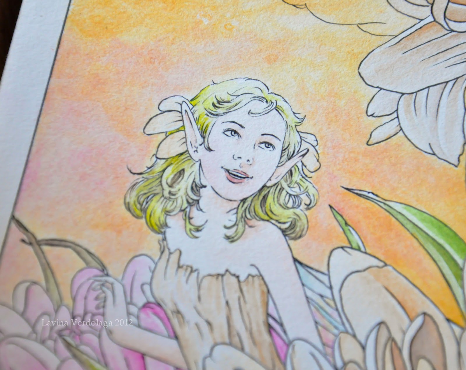
Dewfairies at Work
Ink and watercolor on illustration board
38.4 x 25.7 cm


I recently acquired a set of twelve Derwent Inktense blocks through the generosity of Times Trading Inc., and I've been enjoying time experimenting with them for a piece inspired by the works of Arthur Rackham (as with Marion's Rest).

Inktense blocks are water-soluble ink blocks that boast incredible versatility; they can be rubbed dry onto paper like pastels, or else washed with water like paint. I use them like blocks of watercolor, but they're much more vibrant, opaque, and permanent (so permanent, in fact, that my paintbrushes are stained *o*). 


Unlike with watercolors, dry Inktense washes can be painted over without affecting the layers underneath. For this reason, it's very difficult to cover up mistakes when using Inktense blocks, as once the ink dries on the paper, it can't be lifted or dissolved. It's funny really; I tend to make mistakes a lot, so every time I would lay the paintbrush down on the paper, I'd hold my breath :))

I had a hard time adjusting to the Inktense blocks; for one reason, they weren't blending at all well with my initial choice of paper (Daler-Rowney), and I couldn't gauge the amount of ink to place onto the paper. Finally, though, after managing to find the perfect paper for the blocks (Bainbridge cold press, a US-made illustration board) and spending a considerable while trying out different mixes and paintbrush load amounts, I discovered that Inktense tends to overpower water. 

The blocks can be scraped and the shavings mixed with water.
The blocks are highly concentrated; a single amount mixed with water can already produce a dark, vibrant color on the paper, which can't be effectively blended or removed without first having washed the paper with water. It's thus difficult to use the blocks to create soft paintings, if you're not conscious of your mixes. 

I love how the colors just pop, though :D
Due to their vibrancy, however, Inktense blocks are wonderful for making details stand out, something I'm very partial to. Watercolor tends to fade into the background if not enough paint is loaded into the paintbrush; with Inktense blocks, however, you need only load a little, and it's enough to draw out a bright, clear line on the paper. Moreover, Inktense colors don't bleed into one another as watercolors love to do, a characteristic that I found most useful in painting the under layers of the grass and flowers.

 
I did use watercolor for some portions of this piece, though, in laying down washes for the sky, and the fairies' skin and hair. I wasn't sure of the effect diluted Inktense would produce, and I didn't want to risk botching the fairies' appearance - and if there's anything I truly hate in my painting, it's botching the fairies. 

I've yet to practice painting skin and hair with the Inktense blocks.
In a nutshell, Derwent Inktense blocks are a highly versatile medium (and can, in fact, be used on silk and other surfaces), permanent and vibrant. If used like watercolors, they do require a considerable amount of patience and practice, more so than the watercolor medium itself, I think. If mastered, though, these blocks can produce a vast range of rich and beautiful works.

On that note, I'd like to wish you all once again a Happy Holidays, and a wonderful year ahead. ♥
Share
Tweet
Pin
Share
2 comments
The Carnation's Caper by Lavina Marie Verdolaga
The Carnation's Caper
Watercolor on paper
29.7 x 21.0 cm

This is one of my favorite paintings from the exhibit. I'm particularly proud of the way I painted the background; I was experimenting with gradients, and I thought a merging (interchanging?) effect would make a nice change from my usual background, i.e. emptiness haha. This is also the painting I placed on my calling card.


The card is quite simple compared to other artists' calling cards, but it's good enough I think. Funny thing, I designed and had my cards printed before I purchased a domain for this site, so the info on the card is rather outdated. It's okay though; I'm going to update the design sooner or later, once I'm out of cards. 

On an unrelated note, it's almost Christmas, yay! I've always wanted to paint something for this specific season, but I never find the discipline to. :)) I should really change that attitude of mine, and force myself to get into the 'mood' to paint - and actually finish. I have tons of paintings pending right now, it's a tad irksome. :\ But do expect updates soon; a product review, in particular. It's gonna be - wait for it...

Share
Tweet
Pin
Share
3 comments
Orchid Blooms
Watercolor and acrylic on paper
29.7 x 21.0 cm

I nearly gave up on this painting; firstly, I didn't know what to do with the background, and secondly, the paper was irritatingly difficult to work with - it absorbed water and paint too fast, creating ugly splotches here and there :\ Good thing I was able to salvage the painting with acrylic paint; acrylic paint seems to have a consistency that watercolor paint lacks. Or it might be just the case that I had/ have no idea how to work with watercolors. Either way, I'm not very proud of this painting, but I think it turned out okay. The colors are much lighter and softer in real life, though.

This is still for available for sale if anyone's interested. :)

Share
Tweet
Pin
Share
No comments
Under My Wing
Watercolor on paper
29.7 x 21.0 cm

This was the highlight of the paintings I submitted for ManilART, and is by far the most detailed watercolor painting I've done. All those TWIGS. -_-

Amazingly, it took me just a little over a week to finish this. At first, I was hesitant to stray from my general theme of flower fairies, but at that time, I had already run out of ideas, so I decided to do something different, and paint a bird fairy instead. It didn't take me long to conceptualize the painting; I'd been itching to work on something with twigs, and painting a nest seemed the way to go. The robin egg idea followed a little later.

'Under My Wing' was marketed in the form of a tumbler for the ManilART event, as well as featured on the ManilART Facebook page, as seen below:


I want to work on something like this again, although I'm currently on an art hiatus; I'm just going through one of those dark-cloud moments of mine, where I lose absolutely all faith in my art. Not healthy at all *.*

Share
Tweet
Pin
Share
No comments
With a few of mine and Valerie Chua's paintings, at ManilART

I can't even begin to describe ManilART. I mentioned in my previous post that I was participating in this prestigious event, and now that the event is over, I still can't believe I was part of it at all.

ManilART is the biggest art event of the year, a chance for leading art galleries in the Philippines to come together and showcase their prized collections, and for budding artists, such as myself, to make their presence in the scene known. This year, the event boasted the participation of 40 major galleries, and over 400 artists - the biggest gathering yet.

I was blessed with the opportunity to be featured as one of the exhibiting artists by Romana Go, ManilART's current art director. She was already an acquaintance of mine; we'd meet time and time again, and I always enjoyed her quirky company. A few months ago, we met again at a party at my boyfriend's house, and during one of the conversations, she suddenly broached the subject about ManilART, how she had been assigned the role of art director. I was thrilled for her, of course, and secretly hoping that I'd be able to visit the exhibit this year. To my absolute horror, she casually mentioned that I be a part of it. Before I could recover, she began talking specifics: what medium I used, how many paintings I had, how many more could I do... by the time the party was over, my mind was abuzz. My participation in the exhibit wasn't set in stone, but I had resolved to produce as many paintings as I could nonetheless. 

The wheels were in motion, however; as I strove to make one painting a week, Romana would contact me for updates and news concerning ManilART. My being part of it still wasn't sure - at least to me it wasn't, but I was forced to think otherwise when out of the blue, she asked me to participate in a press interview for the event at SM Megamall. And everything escalated from there: my artwork was splashed on a promotional ManilART tumbler and sold and given away, I was featured on the ManilART Facebook page (you can see the post here), and my paintings were set up on display at the Moon Dragon Art Gallery booth in the SMX Convention Center.
Share
Tweet
Pin
Share
4 comments
Marion's Rest
Watercolor and ink on paper
29.7 x 21.0 cm
(Credits for model: Falln-Stock)

This drawing sure took some work, and I'm happy with the result, I feel like I want to write a story to go along with it, haha!

I used Derwent watercolor pencils for color, and a Uni Pin water- and fade-proof pigment ink pen. The pen is absolutely fantastic, and definitely worth the price (P65.50 or $1.6 in National Bookstore). It doesn't bleed at all, and the ink only becomes blacker under water.

It's a challenge doing ink line art; I was afraid for the most part that any single line out of place would effectively ruin the picture, especially when I was drawing the fairy's facial features. At one point, I even used the wrong pen, which was not waterproof, so I sat squealing for a good while as I watched the ink bleed past the point of salvation. Thankfully I was able to switch pens before the entire picture became a disaster.

You can see the ink I murdered in about this entire portion of the picture :))

I wasn't really consistent with my method for the picture; some parts I did the line art first before adding paint washes, others I painted first and then outlined. There were times I mulled over the number of lines a particular segment of the image might need, but I mostly winged (wung?) it. I had the most fun inking the trees in the background, because they turned out much better than I expected.


This is a looong overdue post; I finished this drawing weeks ago. I've been so busy with my new job as a content writer, which takes up most of my time. It's so taxing, but definitely fun; I learn new stuff everyday! 

Also, there's been that terrible monsoon hitting the Philippines for the past week. Thankfully, our house is set up on a pretty high plane, but gosh, most of Luzon just disappeared under water. ;_; I kept crying as I watched the news, but thank God the rains stopped for now. On a side note, my alma mater, UA&P, became a trending topic on Twitter, for its galant efforts to provide relief to those affected by the monsoon. I'm so proud of those Dragons. I'm proud of everyone, really, striving to protect the Filipino through literal hell and high water.

I hope to blog again soon, there's something I've been working on for a while now, but I can't show it until it's sure and ready. Until then, take care. ♥

Share
Tweet
Pin
Share
No comments
Lull
Watercolor on paper
20 x 15 cm
I've decided to name this series of tiny paintings, 'Flories', short for flora fairies. :3 This is the second one I've done so far, and I'd be really happy with it if it weren't for the bad scan -   for some reason my scanner emphasizes the texture of the watercolor paper. I'm thinking of hunting for hot-pressed paper, which is supposed to be much smoother than cold-pressed paper, which I currently use. Would anyone know where I can find any in the Metro? :)

In other news, I am officially a college graduate, WOOHOO! I'm currently sending out resumes like mad across the region, hoping to land a good job in either the creative or HR/ administrative field. Keeping my fingers crossed! 

P.S. I decided to change my blogger's banner, inserting Five Winks into the image; just to make my blog seem more like me. Let me know what you think! :) Toodles! ♥
Share
Tweet
Pin
Share
No comments
Five Winks
Watercolor on paper
5 x 4 in
Note to self: never use black for a soft image; it ruins everything :| 

I randomly decided to do this small painting, and, for once, with no references - I'm so proud of myself, haha! I can pinpoint a whole bunch of mistakes, though, but I guess that's all part of the learning process.

Someone once told me that I should paint more from imagination like this; I'm thinking of putting a twist to it, maybe a postcard series or something, which I could sell in print form once I make enough paintings. I'll see. :) For now, I must concentrate on job hunting - a funny business, I must say.

Cheers. ♥

Share
Tweet
Pin
Share
2 comments
Our Mother Spring
Watercolor on paper
29.7 x 21.0 cm
(Credits for references: AmethystDreams1987, faestock, nettle-tea)

In line with trying out illustration styles, I came up with this painting. I altered the way I paint hair, and painted birds for the first time in my life - so pardon me if they look strange. Here are some WIP shots:


I had fish in the original sketch instead of birds, but I scrapped them after some thought; I wanted the painting to convey a light, summery feel, and fish didn't quite seem the way to go. And they seemed scarier to paint than birds, haha!

The scan doesn't do the colors justice; I tried as much as I could to digitally correct them :(

I played around with lines and shapes in this painting; I wonder if you can spot the very subtle heart shape that dominates the overall picture (other than in the flower petals). This took quite a while to finish, but it was a fun while! :3 Yay for painting!
Share
Tweet
Pin
Share
No comments
Calla's Morning
Watercolor on paper
29.7 x 21.0 cm
(Credits for model: inspyretash-stock)
As a graduation gift, I was given a 72-set of Derwent watercolor pencils, and I love them soo much!! I used them for the painting above, and they couldn't have worked better with the Daler-Rowney Langton paper. The colors are so amazing, and the paper absorbs them nicely. It's very ironic that I've taken to watercolor painting now, especially since I spent a good portion of my life berating the medium (only because I didn't know how to work with it). Now that I more or less know how to use watercolor pencils, I can't wait to paint more with them! <3

Share
Tweet
Pin
Share
2 comments
So this is the first attempt of the One Thing Challenge I mentioned in my previous post. I'm so ashamed of it, haha! 


I can never get those facial proportions right. Whenever I draw faces from imagination, they always come out cartoony somewhat. I used to doodle such cartoon faces back in high school, and in college for a while, on my planner. Who knows, this could be my one thing, but, being partial to realism, I'm still iffy about it.

In other news, I recently bought brand new Daler-Rowney Langton 300gsm watercolor paper (I'm really into watercolor now!), and I'm just itching to try it out, so I got started on another sketch for a potential painting, using a model as usual.


Since Langton paper isn't really recommended for beginners (a.k.a. yours truly), and it's quite expensive, I'm trying out this sketch-transferring technique I picked up from tutorials posted on deviantART; basically you lay out a preliminary sketch of your work on a sheet of simple paper, then transfer it cleanly onto watercolor paper so as to avoid any potential damage of the watercolor paper. I thought I'd give it a go since I am quite fond of murdering paper through erasing. So far I'm finding the task fun!

A long time ago I came across an interesting quote which I think is applicable to my artistic situation now, and which I think every artist, especially myself, should adhere to,

Don't think about making art, just get it done. Let everyone else decide if it's good or bad, whether they love it or hate it. While they are deciding, make even more art. {Andy Warhol}

Cheers ♥
Share
Tweet
Pin
Share
No comments
Intermission between Chapter Senior Life and Chapter Graduation Day: summer vacation and the listlessness that inevitably blankets this time lag that otherwise calls for partying, exploring islands, or some other exciting adventure-like thing. As for me, I am spending this time quite contentedly with the loving family back in the sandlands where I grew up - Dubai - and I've been doing the same routine every day: sleep, eat, watch my baby niece, play Persona 3 on PPG (my PSP; yes, its name is the acronym for Powerpuff Girls; it's a long story), eat, sleep. Only occasionally I do some art:

This is taking forever for me to finish, haha!

As of today, I have decided to burden myself with a challenge: draw and paint random faces from imagination every day. I used to when I was still in my awkward years (I even created comics) but I stopped when I discovered I copied better. This challenge is to compensate for all the time that I did not spend doing art when I swore I would, but largely it's to find that 'one thing' (cue One Direction) that makes my art mine. I hope I find it ♥ 

In other news, I want to share that I recently found an oval-shaped canvas in Carrefour, and it was so lovely and so inexpensive (Dhs 12 or $3), I had to buy it. I don't know yet what I'm going to paint on it, but the shape calls for some still-life or portrait I think. I'll see if my challenge strikes a bolt of inspiration sooner or later. 

Anyway, so I'm off to hunt for some quality art materials; I accidentally left my watercolor pencils back in Manila, and any decent drawing paper, so I'll be searching for some here. 

Toodles, dear world!
Share
Tweet
Pin
Share
No comments
Pardon the outburst, but I ONLY HAVE THREE WEEKS OF SCHOOL LEFT. :O After that, I can officially call myself a college graduate, ready to dive headfirst into that crazy world they call work. I'm excited and impatient at the same time, especially since we just finished having our graduation and yearbook pictures taken. I thought I'd share my creative shot, which I'm particularly proud of:


I rushed the self-portrait the night before the shoot, so I have my doubts as whether it looks like me or not. Still though, I love that I managed to get it done; I had this idea for my creative shot planned out since my sophomore year. The only thing I don't like about how the pictures turned out is my hair; the way they fixed it, I looked like one of those madames from the sixties with the towering crowns, only more egg-like. I'm just glad my hair wasn't long enough to make an entire skyscraper out of it. In any case, I won't post it here to preserve my dignity.

Anyway, I've been so busy with schoolwork, it's reached a point where I'm literally struggling to stay focused. I've barely any time to do art, although here's one that I managed to squeeze in recently:


This is a new watercolor painting I'm currently working (or trying to work) on; I thought I'd skip the faerie element this time and take a whack at painting something more along the lines of contemporary illustration. Another take on that whole drawing-from-imagination bit I'm trying to practice. I really think I lack that particular lobe in my brain that shoots forth creative juices... or maybe it just preconditioned itself to work only for strictly academic purposes. 

It's difficult conceptualizing a work of illustration; I admire those artists who  place splotches, streaks and whatnot in strategic locations around a painting and pull it off. But maybe I'm just having difficulty because illustration has never been my forte. 

I'll try to update this blog again soon, I've got loads of things I want to share, like new art books, and my first official publication! :) Toodles, take care, reader!

Share
Tweet
Pin
Share
2 comments
Woolgatherer
Watercolor on paper
23 x 30.5 cm
(Credits for model: faestock)

I feel like I'm not updating this blog as much as I should... the weight of my last ever semester is finally sinking in; the workload is just insane, although admittedly some bits are more fun than others (like tonight I have to deliberate on which Akira Kurosawa film I should watch for my Film Theory report next week).

I was only able to do this painting because I managed to finish a paper earlier than I expected; it was supposed to be a speed/ practice painting, but I couldn't resist adding more detail, so the planned two-hour session became a ten-hour episode (which is still faster than my usual). I wanted to practice drawing/ painting from imagination, so I didn't use any references for the flowers and foliage (yes, that's why they look strange). 

On another note, I've been working on giant acrylic pieces to build up on my portfolio, and to get started on my lifelong dream of having an exhibit of my works. It's difficult, however, only because I have to fight my naturally short attention span; I get distracted easily, so I don't usually finish artworks :( It helps that people like my boyfriend are continuously encouraging me to push forward (he gave me a huuge easel and a canvas for Christmas; he's so awesome!), but I hope I can achieve my dream soon.

I'll give a sneak peak of my acrylic paintings later on, but for now, toodles! 


Share
Tweet
Pin
Share
2 comments
Last year I designed a blog header for my good friend Lesley, and she just recently added it to her blog's new layout.

First design (final option)
Alternative design
Lesley is, in a nutshell, a passionate photographer passionate about owls and Starbucks. And fashion. Please do check out her blog The Owl Bones; it's a steady dosage of beautiful photographs narrating her recent food escapade, fashion shoot, LSS, shoe splurge; about anything that she lays her camera eye on. Famous photographer in the making! :D
Share
Tweet
Pin
Share
2 comments
New Prayers
Watercolor on paper
7.5 x 7.5 cm

(Credits for reference: sabrine-photo-stock)

Happy 2012 to you all! I was a bit stressed this morning, so I decided to do this quick painting (completed in a little over two hours) to calm myself, and to perhaps illustrate my pseudo-resolution for this year: to be the best that I can be. If it's the end of the world this year, only God knows; until then, let's try to make each of the 366 days count. :)
Share
Tweet
Pin
Share
2 comments
Older Posts

About me

All images displayed, artwork and non-artwork alike, belong to Lavina Marie Verdolaga unless stated otherwise, and cannot be used or reproduced by any person or company without permission from the author.

Facebook

Blog Archive

  • ▼  2017 (1)
    • ▼  March (1)
      • This blog has been moved!
  • ►  2015 (1)
    • ►  October (1)
  • ►  2013 (10)
    • ►  June (1)
    • ►  April (2)
    • ►  February (2)
    • ►  January (5)
  • ►  2012 (27)
    • ►  December (3)
    • ►  November (1)
    • ►  October (4)
    • ►  September (2)
    • ►  August (1)
    • ►  July (1)
    • ►  June (2)
    • ►  May (3)
    • ►  April (3)
    • ►  March (2)
    • ►  February (1)
    • ►  January (4)
  • ►  2011 (20)
    • ►  December (2)
    • ►  November (6)
    • ►  October (4)
    • ►  September (2)
    • ►  August (6)

Created with by ThemeXpose | Distributed By Gooyaabi Templates