Lavina Marie. Powered by Blogger.

Pages

  • Home
  • Contact
  • Artist
  • Press

BTemplates.com

Follow Pencil Paint

The Art of Lavina Marie


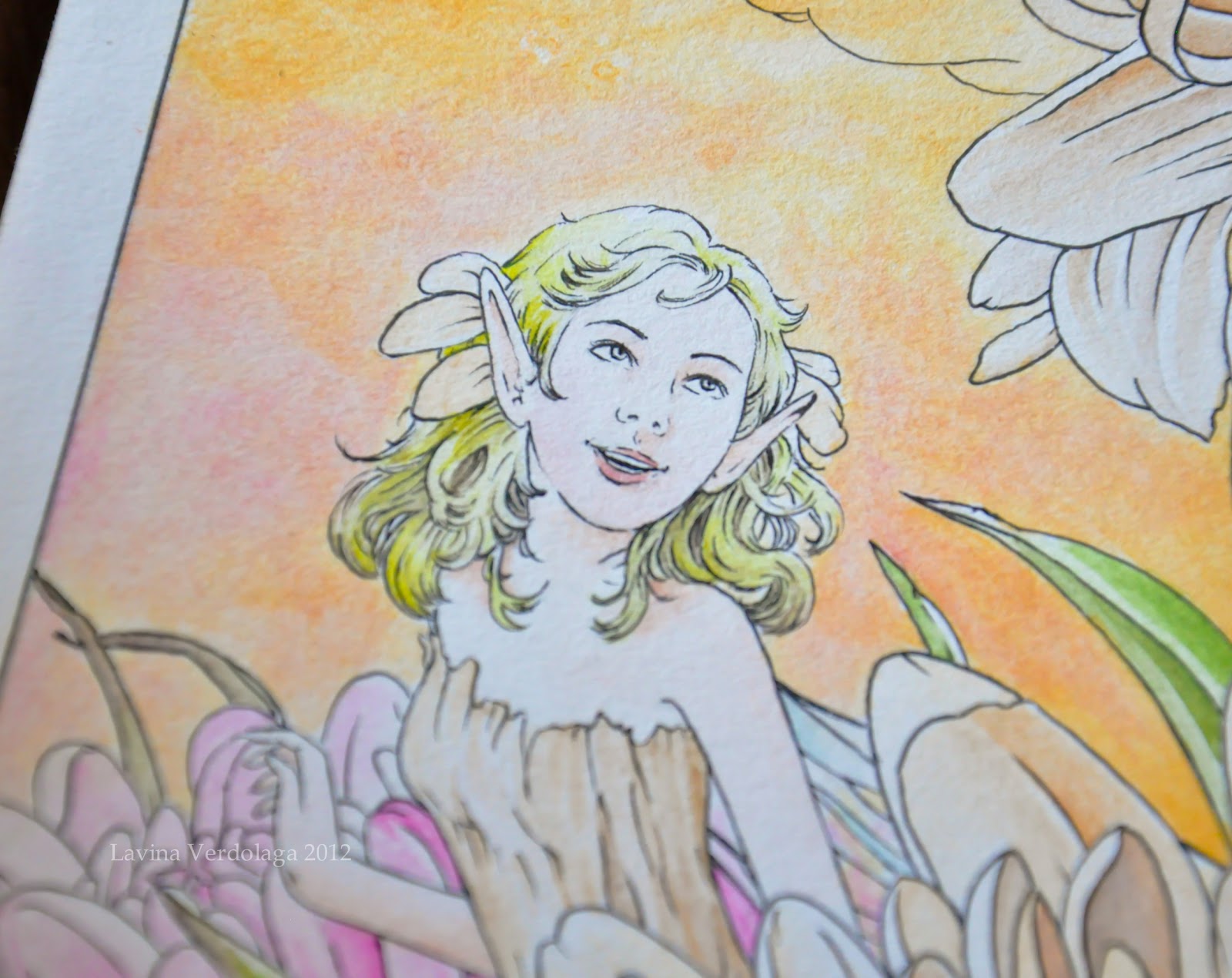
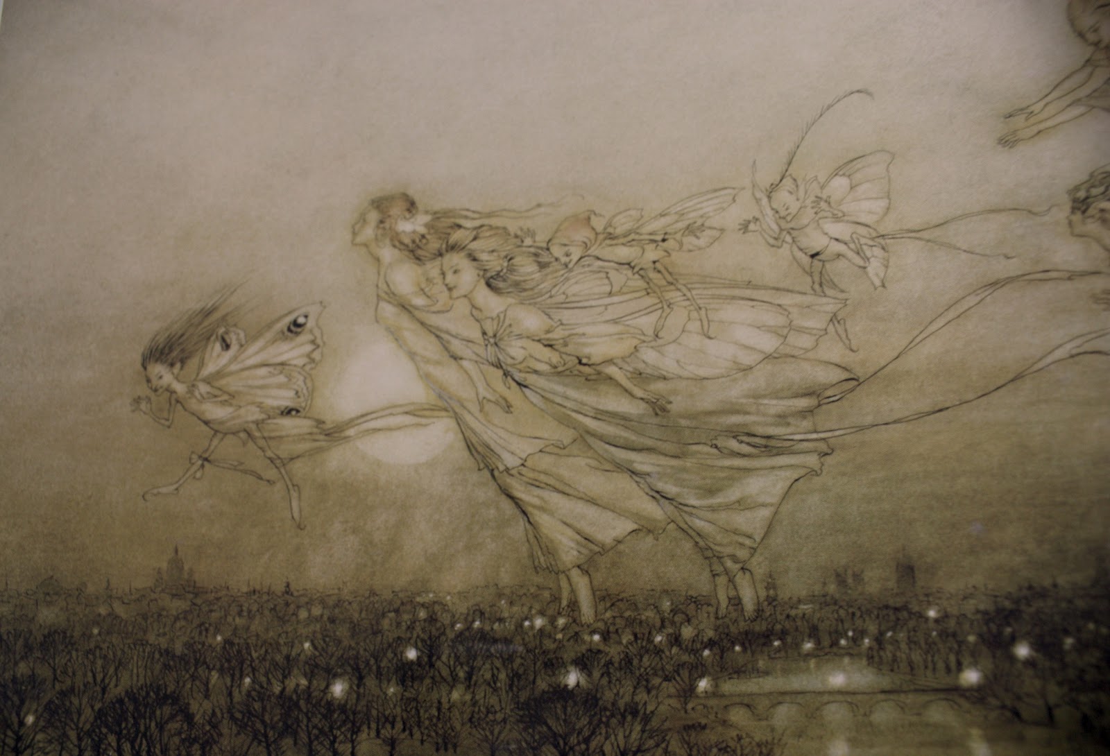
I tried out the new cotton rag paper I'd purchased a few ago from Paperchase, using the Arthur Rackham that I've been recently toying with. This inking technique sure is growing on me; could it be I've found my distinctive style? *o*

I love how the style forces me to practice drawing, which has always been more of my forte than painting. It's a very familiar style, in other words, so I'll see if it works out for me later on. As for the cotton rag paper, I love how it works with ink; I want to hoard more :))

Yesterday, as I was browsing through random illustration blogs on the net, I came across an artist whose work I think mirrors my current experimental style more so than that of Rackham's: Warwick Goble.

From Book of Fairy Poetry VII
1920
A contemporary of Rackham's though not as popular, Goble made a name for himself in creating beautiful fairytale illustrations inspired by Japanese and Indian themes. His work can be found in select MacMillan publications such as The Water Babies (1863) and Treasure Island (1883), as well as in the first edition of The War of the Worlds (1898) by H.G. Wells, and many folk tale anthologies (notably Other Japanese Fairy Tales and Tales of Bengal).

Warwick Goble
Nautilus Ship
Sea Nymphs
Unlike Rackham, Goble seemed to love colors more; in several of his works you can see splashes of different colors (watercolor was his primary paint medium), all encased within thin, almost nonexistent ink lines. I love how soft his technique is; it makes his art appear dreamy, quite perfect for a fairytale setting in my opinion.

A Fairy Revel
I don't think I can ever achieve the subtlety of Goble's work; I'm having a fantastic time trying to though! The controlled application of lines and the delicate washing of colors, blended together in a calculated recipe of imagination to create a story of a thousand words; artists like Warwick Goble remind me how much I love art.

On that note, I'd like to wish you all a happy happy New Year's Eve. :)
Share
Tweet
Pin
Share
No comments
Merry Christmas, everyone! :D I hope you and your families are blessed with love and happiness this season. I've been working on a piece and review for some time now, and I can finally share it with you, and in time for Christmas Day too, haha!
'Dewfairies at Work' by Lavina Marie Verdolaga
Dewfairies at Work
Ink and watercolor on illustration board
38.4 x 25.7 cm


I recently acquired a set of twelve Derwent Inktense blocks through the generosity of Times Trading Inc., and I've been enjoying time experimenting with them for a piece inspired by the works of Arthur Rackham (as with Marion's Rest).

Inktense blocks are water-soluble ink blocks that boast incredible versatility; they can be rubbed dry onto paper like pastels, or else washed with water like paint. I use them like blocks of watercolor, but they're much more vibrant, opaque, and permanent (so permanent, in fact, that my paintbrushes are stained *o*). 


Unlike with watercolors, dry Inktense washes can be painted over without affecting the layers underneath. For this reason, it's very difficult to cover up mistakes when using Inktense blocks, as once the ink dries on the paper, it can't be lifted or dissolved. It's funny really; I tend to make mistakes a lot, so every time I would lay the paintbrush down on the paper, I'd hold my breath :))

I had a hard time adjusting to the Inktense blocks; for one reason, they weren't blending at all well with my initial choice of paper (Daler-Rowney), and I couldn't gauge the amount of ink to place onto the paper. Finally, though, after managing to find the perfect paper for the blocks (Bainbridge cold press, a US-made illustration board) and spending a considerable while trying out different mixes and paintbrush load amounts, I discovered that Inktense tends to overpower water. 

The blocks can be scraped and the shavings mixed with water.
The blocks are highly concentrated; a single amount mixed with water can already produce a dark, vibrant color on the paper, which can't be effectively blended or removed without first having washed the paper with water. It's thus difficult to use the blocks to create soft paintings, if you're not conscious of your mixes. 

I love how the colors just pop, though :D
Due to their vibrancy, however, Inktense blocks are wonderful for making details stand out, something I'm very partial to. Watercolor tends to fade into the background if not enough paint is loaded into the paintbrush; with Inktense blocks, however, you need only load a little, and it's enough to draw out a bright, clear line on the paper. Moreover, Inktense colors don't bleed into one another as watercolors love to do, a characteristic that I found most useful in painting the under layers of the grass and flowers.

 
I did use watercolor for some portions of this piece, though, in laying down washes for the sky, and the fairies' skin and hair. I wasn't sure of the effect diluted Inktense would produce, and I didn't want to risk botching the fairies' appearance - and if there's anything I truly hate in my painting, it's botching the fairies. 

I've yet to practice painting skin and hair with the Inktense blocks.
In a nutshell, Derwent Inktense blocks are a highly versatile medium (and can, in fact, be used on silk and other surfaces), permanent and vibrant. If used like watercolors, they do require a considerable amount of patience and practice, more so than the watercolor medium itself, I think. If mastered, though, these blocks can produce a vast range of rich and beautiful works.

On that note, I'd like to wish you all once again a Happy Holidays, and a wonderful year ahead. ♥
Share
Tweet
Pin
Share
2 comments
My dad is a regular business traveler, and he always makes it a point to bring me back something cute or pretty, like a small figurine, or bookmark. On one of his most recent trips to Korea, he got me a lovely metallic bookmark in the shape of a four-leaf clover. 

The 'leaves' look like wings. Inspiration!
The bookmark was packaged along with a short description of the history of the four-leaf clover; apparently, even Napoleon dabbled in the luck of the Irish, when a bullet narrowly missed his head as he bent to pick up a four-leaf clover he spotted on the ground. I'm not really sure if the story's true, but it's fun to picture it.

Speaking of luck, as I was browsing through Paperchase, one of my favorite stationery stores, I came across a packet of 20 sheets of handmade paper, recycled from cotton rag. What a find! 


The thickness and texture of the paper seem perfect for watercolor and ink work, and the paper's acid-free, to top it off, which means no yellowing, yay! I love that it has frayed edges as well.


I didn't hesitate to buy the paper (Dhs 39, or about $11). I can't wait to try it out! I just hope I get to actually use up the paper; I tend to hoard stationery, and, more often than not, that's exactly what they remain: stationary. Haha! I've all the bad habits of an aspiring artist :))

Christmas is drawing nigh! I hope your December's going well. ♥

Share
Tweet
Pin
Share
No comments
The Carnation's Caper by Lavina Marie Verdolaga
The Carnation's Caper
Watercolor on paper
29.7 x 21.0 cm

This is one of my favorite paintings from the exhibit. I'm particularly proud of the way I painted the background; I was experimenting with gradients, and I thought a merging (interchanging?) effect would make a nice change from my usual background, i.e. emptiness haha. This is also the painting I placed on my calling card.


The card is quite simple compared to other artists' calling cards, but it's good enough I think. Funny thing, I designed and had my cards printed before I purchased a domain for this site, so the info on the card is rather outdated. It's okay though; I'm going to update the design sooner or later, once I'm out of cards. 

On an unrelated note, it's almost Christmas, yay! I've always wanted to paint something for this specific season, but I never find the discipline to. :)) I should really change that attitude of mine, and force myself to get into the 'mood' to paint - and actually finish. I have tons of paintings pending right now, it's a tad irksome. :\ But do expect updates soon; a product review, in particular. It's gonna be - wait for it...

Share
Tweet
Pin
Share
3 comments
Orchid Blooms
Watercolor and acrylic on paper
29.7 x 21.0 cm

I nearly gave up on this painting; firstly, I didn't know what to do with the background, and secondly, the paper was irritatingly difficult to work with - it absorbed water and paint too fast, creating ugly splotches here and there :\ Good thing I was able to salvage the painting with acrylic paint; acrylic paint seems to have a consistency that watercolor paint lacks. Or it might be just the case that I had/ have no idea how to work with watercolors. Either way, I'm not very proud of this painting, but I think it turned out okay. The colors are much lighter and softer in real life, though.

This is still for available for sale if anyone's interested. :)

Share
Tweet
Pin
Share
No comments
Hello everyone! I finally purchased a custom domain for my art blog, so please modify your links to:

www.lavinamarie.com

The .blogspot address will automatically redirect to the new domain, but please do change your links, as I'll be implementing some design changes to my site over (hopefully) the next couple of days. :)

Thank you, and have a great day!
Share
Tweet
Pin
Share
No comments
Under My Wing
Watercolor on paper
29.7 x 21.0 cm

This was the highlight of the paintings I submitted for ManilART, and is by far the most detailed watercolor painting I've done. All those TWIGS. -_-

Amazingly, it took me just a little over a week to finish this. At first, I was hesitant to stray from my general theme of flower fairies, but at that time, I had already run out of ideas, so I decided to do something different, and paint a bird fairy instead. It didn't take me long to conceptualize the painting; I'd been itching to work on something with twigs, and painting a nest seemed the way to go. The robin egg idea followed a little later.

'Under My Wing' was marketed in the form of a tumbler for the ManilART event, as well as featured on the ManilART Facebook page, as seen below:


I want to work on something like this again, although I'm currently on an art hiatus; I'm just going through one of those dark-cloud moments of mine, where I lose absolutely all faith in my art. Not healthy at all *.*

Share
Tweet
Pin
Share
No comments
With a few of mine and Valerie Chua's paintings, at ManilART

I can't even begin to describe ManilART. I mentioned in my previous post that I was participating in this prestigious event, and now that the event is over, I still can't believe I was part of it at all.

ManilART is the biggest art event of the year, a chance for leading art galleries in the Philippines to come together and showcase their prized collections, and for budding artists, such as myself, to make their presence in the scene known. This year, the event boasted the participation of 40 major galleries, and over 400 artists - the biggest gathering yet.

I was blessed with the opportunity to be featured as one of the exhibiting artists by Romana Go, ManilART's current art director. She was already an acquaintance of mine; we'd meet time and time again, and I always enjoyed her quirky company. A few months ago, we met again at a party at my boyfriend's house, and during one of the conversations, she suddenly broached the subject about ManilART, how she had been assigned the role of art director. I was thrilled for her, of course, and secretly hoping that I'd be able to visit the exhibit this year. To my absolute horror, she casually mentioned that I be a part of it. Before I could recover, she began talking specifics: what medium I used, how many paintings I had, how many more could I do... by the time the party was over, my mind was abuzz. My participation in the exhibit wasn't set in stone, but I had resolved to produce as many paintings as I could nonetheless. 

The wheels were in motion, however; as I strove to make one painting a week, Romana would contact me for updates and news concerning ManilART. My being part of it still wasn't sure - at least to me it wasn't, but I was forced to think otherwise when out of the blue, she asked me to participate in a press interview for the event at SM Megamall. And everything escalated from there: my artwork was splashed on a promotional ManilART tumbler and sold and given away, I was featured on the ManilART Facebook page (you can see the post here), and my paintings were set up on display at the Moon Dragon Art Gallery booth in the SMX Convention Center.
Share
Tweet
Pin
Share
4 comments
It's time to reveal what I've been busy with over the past few months. Readers, I'm thrilled to tell you that a week from now, I will be participating in my first ever art exhibit, namely ManilART, the nation's largest annual art exhibit. *squeal*


ManilART is the biggest and hottest contemporary art fair in the Philippines; this year, it will be hosting its fourth exhibition, from October 2 to 6, at the SMX Convention Center, and it will be displaying creative works from leading galleries and over 500 artists. 

I'll talk about the event and my preparation process in detail once it's through, but for now, let me present you with a chance to win tickets to the exhibit. 


1. Like the ManilART Facebook page here.

2. If you are chosen as the 18,000th fan, you will receive 2 free General Admission tickets. 

3. If you win, send a private message to ManilART with the following:
Contest: 18,000th Fan
Name:
Email:
Mobile:
Who is your favorite Philippine artist?
What is your favorite color?
4. Pick up the tickets either at SM Megamall before the event, or at the pre-registration section at the SMX Convention Center during the event. 

5. Claim with a valid ID and Confirmation Code, and a printout of the winner's notification. 

All ManilART decisions are final. Tickets are non-refundable, and non-convertible.

That's it! As of now, there are over fifty more slots left until the page reaches its 18,000th mark. In any case, if you like the page, you'll be able to see updates, contests, and featured artists. So go and like it now :D 

I'm so incredibly happy to be a part of this, and I wish to include you in this wonderful celebration as well <3

Share
Tweet
Pin
Share
No comments


Hello, most wonderful world. I'm preparing for something great, and I can't wait for the time when I can share it with you, which will come soon enough. Until then, do take care! ♥
Share
Tweet
Pin
Share
4 comments
Marion's Rest
Watercolor and ink on paper
29.7 x 21.0 cm
(Credits for model: Falln-Stock)

This drawing sure took some work, and I'm happy with the result, I feel like I want to write a story to go along with it, haha!

I used Derwent watercolor pencils for color, and a Uni Pin water- and fade-proof pigment ink pen. The pen is absolutely fantastic, and definitely worth the price (P65.50 or $1.6 in National Bookstore). It doesn't bleed at all, and the ink only becomes blacker under water.

It's a challenge doing ink line art; I was afraid for the most part that any single line out of place would effectively ruin the picture, especially when I was drawing the fairy's facial features. At one point, I even used the wrong pen, which was not waterproof, so I sat squealing for a good while as I watched the ink bleed past the point of salvation. Thankfully I was able to switch pens before the entire picture became a disaster.

You can see the ink I murdered in about this entire portion of the picture :))

I wasn't really consistent with my method for the picture; some parts I did the line art first before adding paint washes, others I painted first and then outlined. There were times I mulled over the number of lines a particular segment of the image might need, but I mostly winged (wung?) it. I had the most fun inking the trees in the background, because they turned out much better than I expected.


This is a looong overdue post; I finished this drawing weeks ago. I've been so busy with my new job as a content writer, which takes up most of my time. It's so taxing, but definitely fun; I learn new stuff everyday! 

Also, there's been that terrible monsoon hitting the Philippines for the past week. Thankfully, our house is set up on a pretty high plane, but gosh, most of Luzon just disappeared under water. ;_; I kept crying as I watched the news, but thank God the rains stopped for now. On a side note, my alma mater, UA&P, became a trending topic on Twitter, for its galant efforts to provide relief to those affected by the monsoon. I'm so proud of those Dragons. I'm proud of everyone, really, striving to protect the Filipino through literal hell and high water.

I hope to blog again soon, there's something I've been working on for a while now, but I can't show it until it's sure and ready. Until then, take care. ♥

Share
Tweet
Pin
Share
No comments


My maternal grandmother is a creative old soul always seeking to express herself in one way or the other. It was her brilliant idea for us to make personalized stationery out of the scrapbook stuffs we have sitting around the house, gathering dust. At first, she thought of making simple all-purpose cards, but I thought maybe we could expand our craft to include other stationery items, since I've always wanted to try making notebooks, inspired by artpreneurs around the globe. I got to work immediately.


Finding an excellent how-to guide online, I gathered some index cards I had lying around, hunted for some thread, and proceeded to make a trial notebook. It's still pretty rough around the edges, since I lack basic materials (like a cutter and ruler to name a few) but I'm thrilled at the idea of making more, improved notebooks.


I might make my Flories into such notebooks, when I've mastered the craft. I'm so excited about this project, it's the first time my grandmother and I are doing anything like this! <3
Share
Tweet
Pin
Share
8 comments
I've always been fascinated with old-style fairytale illustrations, the kind you'll find in Enid Blyton books - lovely pictures of the folk dabbed with touches of color and lined delicately with ink. I was leafing through my beloved Fairy Art book last night when I was reacquainted with this particular style of art, particularly in the paintings of 19th century artist Arthur Rackham, who illustrated for Alice's Adventures in Wonderland (1907) and Fairy Tales of the Grimm Brothers (1909).

The Fairies Have Their Tiff with the Birds
1906
Look at his lines, they're incredible! I love how dualistic his artwork appears: simplistic because of the delicate ink outlining his images; yet detailed, with the sheer number of lines that he puts into each image.


The Guest of Honour: A Baby Attended by Sprites and Fairies
1905

Rackham's technique is described in the book as 'a unique style that blended pictorial elegance with a taste for the grotesque'. Interestingly, he derived inspiration from Japanese prints, which perhaps might be apparent in the thin lines of ink that Rackham used, although of course his fairy subjects look more Western, with fair heads and a classical physique.

Other fairies of his look more impish, the kind that Brian Froud so vividly portrays. These kind of fairies I admire the most (thought I don't draw them), since they shatter the typical fairy image drastically (you know, the Disney stereotype of wands and fairy dust; but those are awesome too).


Twilight Dreams
1915

Rackham's style isn't new these days; I suppose he served as the forerunner for contemporary artists such as Amy Brown and Meredith Dillman, both of whom use the line technique in their fairy art. Although what I noticed about Rackham is that he had a certain fondness for sepia; at least judging by the paintings displayed in the book, he kept a limited color scheme for each of his paintings, washing over any reds or blues with hints of gray or brown to soften them and achieve an overall palette. 


Autumn Fairies
1906
After managing to tear my eyes away from his art, I thought - since I was/ am in a bit of a creative pitstop (I've already run out of ideas for my Flories series) - of experimenting with this style of painting; it was just too brilliant not to. 


Of course, it's no illustration worthy of Peter Pan. But I love how my take on the style is going so far. I'll talk about it in detail once I'm finished. :)

Share
Tweet
Pin
Share
4 comments
Lull
Watercolor on paper
20 x 15 cm
I've decided to name this series of tiny paintings, 'Flories', short for flora fairies. :3 This is the second one I've done so far, and I'd be really happy with it if it weren't for the bad scan -   for some reason my scanner emphasizes the texture of the watercolor paper. I'm thinking of hunting for hot-pressed paper, which is supposed to be much smoother than cold-pressed paper, which I currently use. Would anyone know where I can find any in the Metro? :)

In other news, I am officially a college graduate, WOOHOO! I'm currently sending out resumes like mad across the region, hoping to land a good job in either the creative or HR/ administrative field. Keeping my fingers crossed! 

P.S. I decided to change my blogger's banner, inserting Five Winks into the image; just to make my blog seem more like me. Let me know what you think! :) Toodles! ♥
Share
Tweet
Pin
Share
No comments
Five Winks
Watercolor on paper
5 x 4 in
Note to self: never use black for a soft image; it ruins everything :| 

I randomly decided to do this small painting, and, for once, with no references - I'm so proud of myself, haha! I can pinpoint a whole bunch of mistakes, though, but I guess that's all part of the learning process.

Someone once told me that I should paint more from imagination like this; I'm thinking of putting a twist to it, maybe a postcard series or something, which I could sell in print form once I make enough paintings. I'll see. :) For now, I must concentrate on job hunting - a funny business, I must say.

Cheers. ♥

Share
Tweet
Pin
Share
2 comments
Our Mother Spring
Watercolor on paper
29.7 x 21.0 cm
(Credits for references: AmethystDreams1987, faestock, nettle-tea)

In line with trying out illustration styles, I came up with this painting. I altered the way I paint hair, and painted birds for the first time in my life - so pardon me if they look strange. Here are some WIP shots:


I had fish in the original sketch instead of birds, but I scrapped them after some thought; I wanted the painting to convey a light, summery feel, and fish didn't quite seem the way to go. And they seemed scarier to paint than birds, haha!

The scan doesn't do the colors justice; I tried as much as I could to digitally correct them :(

I played around with lines and shapes in this painting; I wonder if you can spot the very subtle heart shape that dominates the overall picture (other than in the flower petals). This took quite a while to finish, but it was a fun while! :3 Yay for painting!
Share
Tweet
Pin
Share
No comments

Day 2 of my One Thing Challenge (does it count if it's not daily?); I did this while watching CSI: NY... I kinda like how the side-view turned out, although I know I have much to work on. 

In other news, I must share what I found in Kinokuniya the other day: an edition of Pride and Prejudice with a hand-painted cover design:


Back cover, with a quote from Mr. Darcy; everything is just so pretty!
Sterling Publishing came out with a new line of classics with these hand-painted cover designs, done by Aura Lewis. The others I saw were Sense and Sensibility, Jane Eyre, and Wuthering Heights; I wanted to get them all, haha! They're relatively inexpensive too (about $10), but I thought of getting this novel in particular since I've always wanted to read Pride and Prejudice. When my mom saw it, she asked me, "Are you going to join the Austen Club now?" :))

That's it for now. I'll post soon, with a new illustration I've been working on. Toodles! ♥

Share
Tweet
Pin
Share
No comments
Calla's Morning
Watercolor on paper
29.7 x 21.0 cm
(Credits for model: inspyretash-stock)
As a graduation gift, I was given a 72-set of Derwent watercolor pencils, and I love them soo much!! I used them for the painting above, and they couldn't have worked better with the Daler-Rowney Langton paper. The colors are so amazing, and the paper absorbs them nicely. It's very ironic that I've taken to watercolor painting now, especially since I spent a good portion of my life berating the medium (only because I didn't know how to work with it). Now that I more or less know how to use watercolor pencils, I can't wait to paint more with them! <3

Share
Tweet
Pin
Share
2 comments
So this is the first attempt of the One Thing Challenge I mentioned in my previous post. I'm so ashamed of it, haha! 


I can never get those facial proportions right. Whenever I draw faces from imagination, they always come out cartoony somewhat. I used to doodle such cartoon faces back in high school, and in college for a while, on my planner. Who knows, this could be my one thing, but, being partial to realism, I'm still iffy about it.

In other news, I recently bought brand new Daler-Rowney Langton 300gsm watercolor paper (I'm really into watercolor now!), and I'm just itching to try it out, so I got started on another sketch for a potential painting, using a model as usual.


Since Langton paper isn't really recommended for beginners (a.k.a. yours truly), and it's quite expensive, I'm trying out this sketch-transferring technique I picked up from tutorials posted on deviantART; basically you lay out a preliminary sketch of your work on a sheet of simple paper, then transfer it cleanly onto watercolor paper so as to avoid any potential damage of the watercolor paper. I thought I'd give it a go since I am quite fond of murdering paper through erasing. So far I'm finding the task fun!

A long time ago I came across an interesting quote which I think is applicable to my artistic situation now, and which I think every artist, especially myself, should adhere to,

Don't think about making art, just get it done. Let everyone else decide if it's good or bad, whether they love it or hate it. While they are deciding, make even more art. {Andy Warhol}

Cheers ♥
Share
Tweet
Pin
Share
No comments
Intermission between Chapter Senior Life and Chapter Graduation Day: summer vacation and the listlessness that inevitably blankets this time lag that otherwise calls for partying, exploring islands, or some other exciting adventure-like thing. As for me, I am spending this time quite contentedly with the loving family back in the sandlands where I grew up - Dubai - and I've been doing the same routine every day: sleep, eat, watch my baby niece, play Persona 3 on PPG (my PSP; yes, its name is the acronym for Powerpuff Girls; it's a long story), eat, sleep. Only occasionally I do some art:

This is taking forever for me to finish, haha!

As of today, I have decided to burden myself with a challenge: draw and paint random faces from imagination every day. I used to when I was still in my awkward years (I even created comics) but I stopped when I discovered I copied better. This challenge is to compensate for all the time that I did not spend doing art when I swore I would, but largely it's to find that 'one thing' (cue One Direction) that makes my art mine. I hope I find it ♥ 

In other news, I want to share that I recently found an oval-shaped canvas in Carrefour, and it was so lovely and so inexpensive (Dhs 12 or $3), I had to buy it. I don't know yet what I'm going to paint on it, but the shape calls for some still-life or portrait I think. I'll see if my challenge strikes a bolt of inspiration sooner or later. 

Anyway, so I'm off to hunt for some quality art materials; I accidentally left my watercolor pencils back in Manila, and any decent drawing paper, so I'll be searching for some here. 

Toodles, dear world!
Share
Tweet
Pin
Share
No comments
I present to you, Baht, Boots, and Gandhi: the first book that I illustrated for, and that was just launched last Thursday! :D


Quick backstory: last year, over one of our lunches, my aunt mentioned that she and her two friends were bent on compiling a series of travel essays, and publishing it in book form. Half-jokingly, I asked if I could illustrate for it, and she said yes. It was only months later, in December, that I got around to working on the illustrations, for she reminded me about it, saying the book was quickly on its way to the printing press. 
They only wanted simple illustrations, my aunt affirmed, nothing too detailed lest the actual printing sacrificed some of the quality. At first, the drafts that I sent reflected specific essays, and were rendered in a cartoon style (as seen above). 

Then, my aunt relayed the feedback from her friends; they found the illustrations alright, but not quite in line with the style of the book cover. "Do you know what retro looks like?" my aunt asked me, and Betty Boop popped into my head. "Something like that," my aunt laughed, and I was thus faced with a new challenge. I had never in my life attempted to draw a retro-style cartoon. I had to scour Google for samples in order to come up with something that looked even remotely retro. Also, the content of the images had changed; now my aunt and her friends requested specific subjects. My aunt wanted a remake of the same island girl as above; author Mo Francisco wanted me to draw her riding the roof of a jeepney, and Gayle Certeza wanted an Alice-in-Wonderland feel to her illustration.

Before I knew it, the new drafts were sent for coloring. One day, my aunt handed to me a published version of the finished book. I caught my name at the back, and did a double-take. Only then did it occur to me that this was serious business. My name is on the cover. I squealed my joy to high glory.

And here are the finished illustrations:


It's so unreal, seeing my drawings on fancy paper, haha!

Each of the illustrations serve as introductions to the authors' biography and acknowledgements. They turned out so nicely, especially with John Casipe's coloring (who I haven't met). 

The book launch was held at the Filipinas National Heritage Library, serving as the opening to the 'Babaenihan' event that celebrated women (that day was International Women's Day). I arrived there early enough to take a few shots of the place while it was relatively empty, and already I could feel the buzz of excitement. My aunt seemed anxious, while her two friends whizzed about in a rush of adrenaline. After cocktails were served, the event opened with a welcoming note by Tweet Sering, author of Astigirl, and was then followed by readings of the three authors of Baht, Boots and Gandhi. The whole event ended with a series of inspirational talks from 'astigirls' (which I wasn't able to catch; astig means 'cool', although in a superlative form, almost ineffably cool - hence astigirls means cool or awesome girls). 

I didn't take much pictures, but here are some of the ones that I did take:


Promotional tarps outside the building
The reception area

The bookstore has such an amazing collection; I kept squealing, "Sources!" (What the Humanities has
done to me...)


Right to left: Gayle Certeza, Gina Verdolaga, Mo Francisco

Look, my illustration's on the screen! :D
My aunt signing her first autograph


A shout-out to my aunt: I'm so proud of you, Tita Gina! A big congratulations, and thank you sooo much for letting me be a part of this big adventure of yours; I hope you have plenty more in the future! I love you!

To the reader, Baht, Boots, and Gandhi will be available to the public soon; I'll let you know when! :) If you come across it, do take the time to read through it, the essays are absolutely wonderful and thoroughly amusing. The book makes you want to travel and write your own stuff!

Thanks for reading, and take care! Woohoo, I'm (sorta) published!
Share
Tweet
Pin
Share
10 comments
Newer Posts
Older Posts

About me

All images displayed, artwork and non-artwork alike, belong to Lavina Marie Verdolaga unless stated otherwise, and cannot be used or reproduced by any person or company without permission from the author.

Facebook

Blog Archive

  • ►  2017 (1)
    • ►  March (1)
  • ►  2015 (1)
    • ►  October (1)
  • ►  2013 (10)
    • ►  June (1)
    • ►  April (2)
    • ►  February (2)
    • ►  January (5)
  • ▼  2012 (27)
    • ▼  December (3)
      • Warwick Goble: Subdued Stories
      • Derwent Inktense Blocks Review
      • Clovers and Cotton
    • ►  November (1)
      • The Carnation's Caper
    • ►  October (4)
      • Orchid Blooms
      • New Domain
      • Under My Wing
      • ManilART 2012
    • ►  September (2)
      • Win Tickets to ManilART
      • Preparation
    • ►  August (1)
      • Marion's Rest
    • ►  July (1)
      • Handmade
    • ►  June (2)
      • Arthur Rackham: Tales of the Folk
      • Lull
    • ►  May (3)
      • Five Winks
      • Our Mother Spring
      • OTC 2; New Classics
    • ►  April (3)
      • Calla Lilies and Pencils
      • OTC 1; New Techniques
      • One Thing Challenge
    • ►  March (2)
      • Published
    • ►  February (1)
    • ►  January (4)
  • ►  2011 (20)
    • ►  December (2)
    • ►  November (6)
    • ►  October (4)
    • ►  September (2)
    • ►  August (6)

Created with by ThemeXpose | Distributed By Gooyaabi Templates