Lavina Marie. Powered by Blogger.

Pages

  • Home
  • Contact
  • Artist
  • Press

BTemplates.com

Follow Pencil Paint

The Art of Lavina Marie

Probably on account of my childhood fondness for Polly Pocket, I've developed an affinity for all things miniature: miniature furniture, miniature dolls; but what really drives me over the edge and into the sea of kiddish delight... is miniature food. 

My small but growing collection
I only came to know and love miniature food - that is, food that looks real but is made out of clay or other similar material, and is TINY - in the 2000s, upon stumbling across a member of deviantART who propagated the stuff as a form of art. Known for her handle PetitPlat, Stephanie Kilgast has taken the miniature art world by storm with her amazing polymer clay creations:

Photos from PetitPlat
As much as I'd love to get my hands on those incredibly CUTE foods, they're unfortunately out of my reach, quite literally; most of the best miniature foods are only sold abroad, usually in the US and some parts of Europe, and are slightly above my spending capability, haha.

However, the most readily available and affordable miniature foods that I've come across so far are in Bangkok, Thailand. Though not as heavily detailed as others, the foods there are still nothing short of amazing. During my last visit, I managed to buy the first items of my miniature food collection:

Jars of donuts, bread, and macaroons *u*
Smaller than a piso coin!
This was all I was able to buy at the time. When I found out a couple of months ago that Joey was heading out to Bangkok for business, I asked him to buy me me one or two more. He came back with several, and just the other day, he handed them to me:


So awesome ♥ Now I just need a tiny shelf to display all these items, haha! Miniature shelves and display cases are also available in Bangkok, but are relatively expensive - between P500 to P1000. Perhaps when I've acquired a steady income I'll have the chance to expand my collection. For now, I'm content with these pastry and sushi lovelies of mine. I actually want to try making some foods myself, using polymer clay, but I think that endeavor can wait; I have my art and watercolor workshop pending :D

I hope your day's going well!
Share
Tweet
Pin
Share
2 comments
Hello everyone! This may seem rather sudden, but I'll be conducting a basic watercolor workshop this month and next:


The workshop will facilitate the instruction and use of Derwent Inktense Blocks in basic watercolor painting. I'll be teaching participants to know and understand colors and tones, as well as to paint subjects hands-on using techniques and exercises that are fundamental for effective watercolor painting. It's gonna be fun! :D

There will be two batches for the workshop, one on January 26, the second on February 23 (both Saturdays). There are only 15 slots available for each batch, so if you wish to make a reservation, please do so now (deadline is January 18)! Materials and handouts will be provided. If you have any questions, please contact me here, or else inquire through the number and email provided in the poster. Thank you, and I hope to see you there! ♥
Share
Tweet
Pin
Share
No comments

L-R: 'Hunger' by Carle Griffiths, 'Nostalgia Pink' by Mandy Lynne, 'Blush' by Valerie Chua
(Photos from Etsy.com)


'A Heart's Dance' by Lavina Marie Verdolaga
A Heart's Dance
Watercolor and ink on cotton rag
14.8 x 21.0 cm

Postcard art has and continues to be one of the more effective means of marketing one's art to prospective buyers. It's a trend that I've always admired (just look at those lovely postcards up there), but I've never seriously considered joining the bandwagon myself... until I began working on this particular ink and watercolor piece: A Heart's Dance.

I find none of my previous paintings worthy of being on a postcard, but for some reason, this particular ink painting breaks the mold; I think it's the Rackham-cum-Goble style that does it, along with the size and texture of the paper I used for it, that makes it seem perfect for a postcard series featuring storybook-like illustrations. 

I know I've had several of these 'great ideas' in the past which never really took off, like my One Thing Challenge and my Flories series, but I'm really liking the idea of creating postcard art. It'll be a fun project to work on for this year, I believe, as each painting will be small and thus easier to finish, but detailed enough to warrant at least a considerable amount of my attention.

I'm not sure yet if I'll sell the postcards; heck, I don't even know how to go about printing them, haha! My friend Kai Jimenez and I have yet to scour the streets of Manila for a good printer; we've decided to team up for this postcard project - my paintings and her photographs (check out her beautifully introspective work here) - to fulfill one of our mutual personal aspirations. So, if you have any suggestions, we'd love to hear them!

Share
Tweet
Pin
Share
No comments

I tried out the new cotton rag paper I'd purchased a few ago from Paperchase, using the Arthur Rackham that I've been recently toying with. This inking technique sure is growing on me; could it be I've found my distinctive style? *o*

I love how the style forces me to practice drawing, which has always been more of my forte than painting. It's a very familiar style, in other words, so I'll see if it works out for me later on. As for the cotton rag paper, I love how it works with ink; I want to hoard more :))

Yesterday, as I was browsing through random illustration blogs on the net, I came across an artist whose work I think mirrors my current experimental style more so than that of Rackham's: Warwick Goble.

From Book of Fairy Poetry VII
1920
A contemporary of Rackham's though not as popular, Goble made a name for himself in creating beautiful fairytale illustrations inspired by Japanese and Indian themes. His work can be found in select MacMillan publications such as The Water Babies (1863) and Treasure Island (1883), as well as in the first edition of The War of the Worlds (1898) by H.G. Wells, and many folk tale anthologies (notably Other Japanese Fairy Tales and Tales of Bengal).

Warwick Goble
Nautilus Ship
Sea Nymphs
Unlike Rackham, Goble seemed to love colors more; in several of his works you can see splashes of different colors (watercolor was his primary paint medium), all encased within thin, almost nonexistent ink lines. I love how soft his technique is; it makes his art appear dreamy, quite perfect for a fairytale setting in my opinion.

A Fairy Revel
I don't think I can ever achieve the subtlety of Goble's work; I'm having a fantastic time trying to though! The controlled application of lines and the delicate washing of colors, blended together in a calculated recipe of imagination to create a story of a thousand words; artists like Warwick Goble remind me how much I love art.

On that note, I'd like to wish you all a happy happy New Year's Eve. :)
Share
Tweet
Pin
Share
No comments
Merry Christmas, everyone! :D I hope you and your families are blessed with love and happiness this season. I've been working on a piece and review for some time now, and I can finally share it with you, and in time for Christmas Day too, haha!
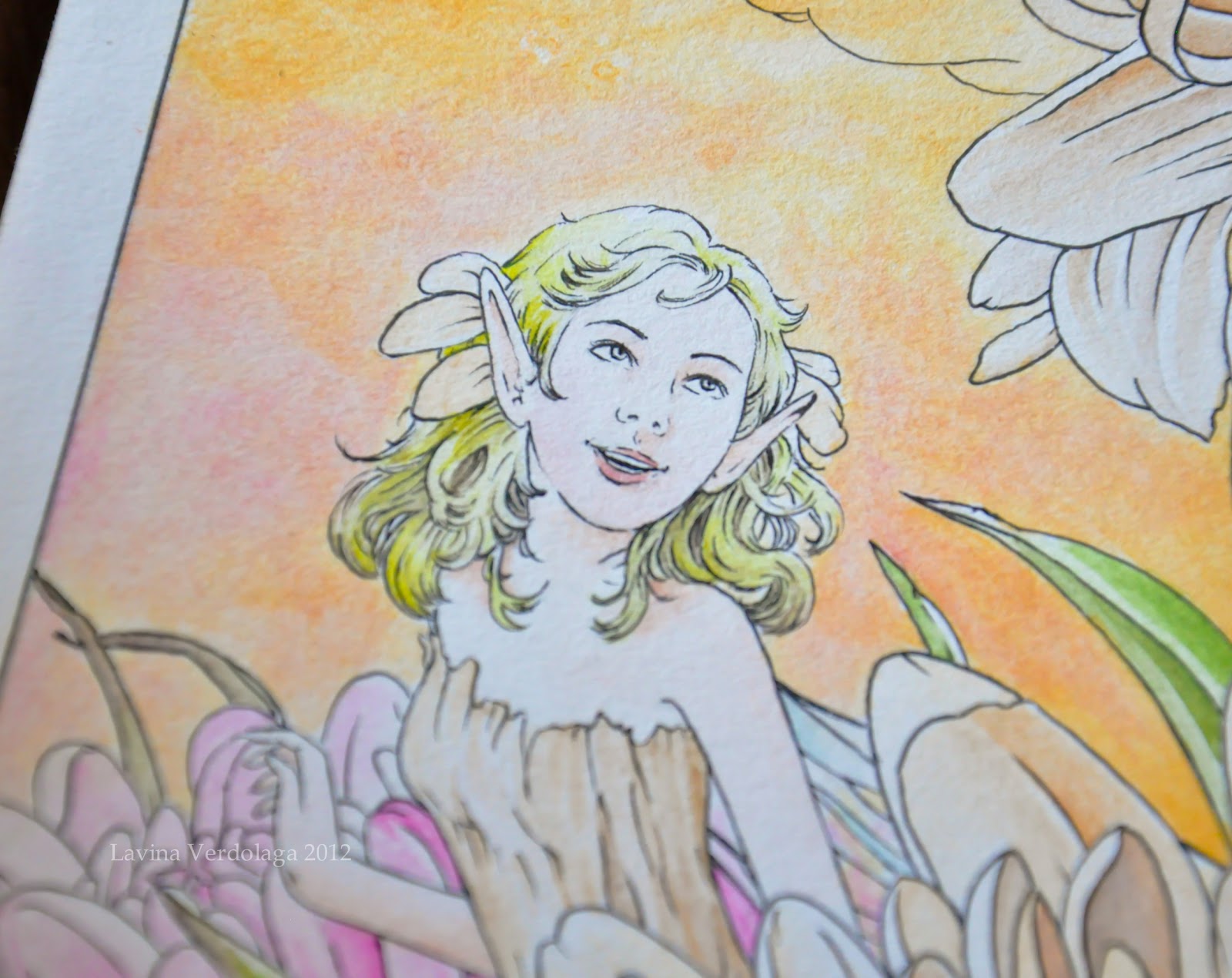
'Dewfairies at Work' by Lavina Marie Verdolaga
Dewfairies at Work
Ink and watercolor on illustration board
38.4 x 25.7 cm


I recently acquired a set of twelve Derwent Inktense blocks through the generosity of Times Trading Inc., and I've been enjoying time experimenting with them for a piece inspired by the works of Arthur Rackham (as with Marion's Rest).

Inktense blocks are water-soluble ink blocks that boast incredible versatility; they can be rubbed dry onto paper like pastels, or else washed with water like paint. I use them like blocks of watercolor, but they're much more vibrant, opaque, and permanent (so permanent, in fact, that my paintbrushes are stained *o*). 


Unlike with watercolors, dry Inktense washes can be painted over without affecting the layers underneath. For this reason, it's very difficult to cover up mistakes when using Inktense blocks, as once the ink dries on the paper, it can't be lifted or dissolved. It's funny really; I tend to make mistakes a lot, so every time I would lay the paintbrush down on the paper, I'd hold my breath :))

I had a hard time adjusting to the Inktense blocks; for one reason, they weren't blending at all well with my initial choice of paper (Daler-Rowney), and I couldn't gauge the amount of ink to place onto the paper. Finally, though, after managing to find the perfect paper for the blocks (Bainbridge cold press, a US-made illustration board) and spending a considerable while trying out different mixes and paintbrush load amounts, I discovered that Inktense tends to overpower water. 

The blocks can be scraped and the shavings mixed with water.
The blocks are highly concentrated; a single amount mixed with water can already produce a dark, vibrant color on the paper, which can't be effectively blended or removed without first having washed the paper with water. It's thus difficult to use the blocks to create soft paintings, if you're not conscious of your mixes. 

I love how the colors just pop, though :D
Due to their vibrancy, however, Inktense blocks are wonderful for making details stand out, something I'm very partial to. Watercolor tends to fade into the background if not enough paint is loaded into the paintbrush; with Inktense blocks, however, you need only load a little, and it's enough to draw out a bright, clear line on the paper. Moreover, Inktense colors don't bleed into one another as watercolors love to do, a characteristic that I found most useful in painting the under layers of the grass and flowers.

 
I did use watercolor for some portions of this piece, though, in laying down washes for the sky, and the fairies' skin and hair. I wasn't sure of the effect diluted Inktense would produce, and I didn't want to risk botching the fairies' appearance - and if there's anything I truly hate in my painting, it's botching the fairies. 

I've yet to practice painting skin and hair with the Inktense blocks.
In a nutshell, Derwent Inktense blocks are a highly versatile medium (and can, in fact, be used on silk and other surfaces), permanent and vibrant. If used like watercolors, they do require a considerable amount of patience and practice, more so than the watercolor medium itself, I think. If mastered, though, these blocks can produce a vast range of rich and beautiful works.

On that note, I'd like to wish you all once again a Happy Holidays, and a wonderful year ahead. ♥
Share
Tweet
Pin
Share
2 comments
My dad is a regular business traveler, and he always makes it a point to bring me back something cute or pretty, like a small figurine, or bookmark. On one of his most recent trips to Korea, he got me a lovely metallic bookmark in the shape of a four-leaf clover. 

The 'leaves' look like wings. Inspiration!
The bookmark was packaged along with a short description of the history of the four-leaf clover; apparently, even Napoleon dabbled in the luck of the Irish, when a bullet narrowly missed his head as he bent to pick up a four-leaf clover he spotted on the ground. I'm not really sure if the story's true, but it's fun to picture it.

Speaking of luck, as I was browsing through Paperchase, one of my favorite stationery stores, I came across a packet of 20 sheets of handmade paper, recycled from cotton rag. What a find! 


The thickness and texture of the paper seem perfect for watercolor and ink work, and the paper's acid-free, to top it off, which means no yellowing, yay! I love that it has frayed edges as well.


I didn't hesitate to buy the paper (Dhs 39, or about $11). I can't wait to try it out! I just hope I get to actually use up the paper; I tend to hoard stationery, and, more often than not, that's exactly what they remain: stationary. Haha! I've all the bad habits of an aspiring artist :))

Christmas is drawing nigh! I hope your December's going well. ♥

Share
Tweet
Pin
Share
No comments
The Carnation's Caper by Lavina Marie Verdolaga
The Carnation's Caper
Watercolor on paper
29.7 x 21.0 cm

This is one of my favorite paintings from the exhibit. I'm particularly proud of the way I painted the background; I was experimenting with gradients, and I thought a merging (interchanging?) effect would make a nice change from my usual background, i.e. emptiness haha. This is also the painting I placed on my calling card.


The card is quite simple compared to other artists' calling cards, but it's good enough I think. Funny thing, I designed and had my cards printed before I purchased a domain for this site, so the info on the card is rather outdated. It's okay though; I'm going to update the design sooner or later, once I'm out of cards. 

On an unrelated note, it's almost Christmas, yay! I've always wanted to paint something for this specific season, but I never find the discipline to. :)) I should really change that attitude of mine, and force myself to get into the 'mood' to paint - and actually finish. I have tons of paintings pending right now, it's a tad irksome. :\ But do expect updates soon; a product review, in particular. It's gonna be - wait for it...

Share
Tweet
Pin
Share
3 comments
Newer Posts
Older Posts

About me

All images displayed, artwork and non-artwork alike, belong to Lavina Marie Verdolaga unless stated otherwise, and cannot be used or reproduced by any person or company without permission from the author.

Facebook

Blog Archive

  • ▼  2017 (1)
    • ▼  March (1)
      • This blog has been moved!
  • ►  2015 (1)
    • ►  October (1)
  • ►  2013 (10)
    • ►  June (1)
    • ►  April (2)
    • ►  February (2)
    • ►  January (5)
  • ►  2012 (27)
    • ►  December (3)
    • ►  November (1)
    • ►  October (4)
    • ►  September (2)
    • ►  August (1)
    • ►  July (1)
    • ►  June (2)
    • ►  May (3)
    • ►  April (3)
    • ►  March (2)
    • ►  February (1)
    • ►  January (4)
  • ►  2011 (20)
    • ►  December (2)
    • ►  November (6)
    • ►  October (4)
    • ►  September (2)
    • ►  August (6)

Created with by ThemeXpose | Distributed By Gooyaabi Templates