Lavina Marie. Powered by Blogger.

Pages

  • Home
  • Contact
  • Artist
  • Press

BTemplates.com

Follow Pencil Paint

The Art of Lavina Marie


I tried out the new cotton rag paper I'd purchased a few ago from Paperchase, using the Arthur Rackham that I've been recently toying with. This inking technique sure is growing on me; could it be I've found my distinctive style? *o*

I love how the style forces me to practice drawing, which has always been more of my forte than painting. It's a very familiar style, in other words, so I'll see if it works out for me later on. As for the cotton rag paper, I love how it works with ink; I want to hoard more :))

Yesterday, as I was browsing through random illustration blogs on the net, I came across an artist whose work I think mirrors my current experimental style more so than that of Rackham's: Warwick Goble.

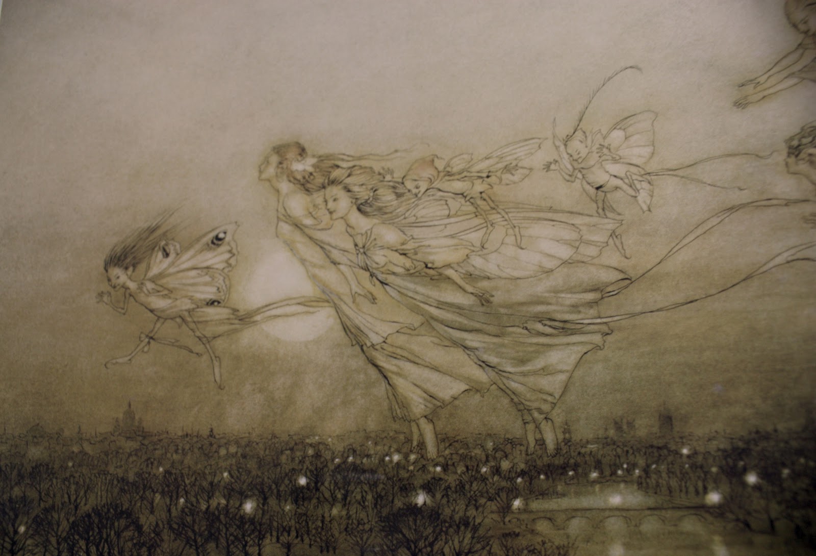
From Book of Fairy Poetry VII
1920
A contemporary of Rackham's though not as popular, Goble made a name for himself in creating beautiful fairytale illustrations inspired by Japanese and Indian themes. His work can be found in select MacMillan publications such as The Water Babies (1863) and Treasure Island (1883), as well as in the first edition of The War of the Worlds (1898) by H.G. Wells, and many folk tale anthologies (notably Other Japanese Fairy Tales and Tales of Bengal).

Warwick Goble
Nautilus Ship
Sea Nymphs
Unlike Rackham, Goble seemed to love colors more; in several of his works you can see splashes of different colors (watercolor was his primary paint medium), all encased within thin, almost nonexistent ink lines. I love how soft his technique is; it makes his art appear dreamy, quite perfect for a fairytale setting in my opinion.

A Fairy Revel
I don't think I can ever achieve the subtlety of Goble's work; I'm having a fantastic time trying to though! The controlled application of lines and the delicate washing of colors, blended together in a calculated recipe of imagination to create a story of a thousand words; artists like Warwick Goble remind me how much I love art.

On that note, I'd like to wish you all a happy happy New Year's Eve. :)
Share
Tweet
Pin
Share
No comments
With a few of mine and Valerie Chua's paintings, at ManilART

I can't even begin to describe ManilART. I mentioned in my previous post that I was participating in this prestigious event, and now that the event is over, I still can't believe I was part of it at all.

ManilART is the biggest art event of the year, a chance for leading art galleries in the Philippines to come together and showcase their prized collections, and for budding artists, such as myself, to make their presence in the scene known. This year, the event boasted the participation of 40 major galleries, and over 400 artists - the biggest gathering yet.

I was blessed with the opportunity to be featured as one of the exhibiting artists by Romana Go, ManilART's current art director. She was already an acquaintance of mine; we'd meet time and time again, and I always enjoyed her quirky company. A few months ago, we met again at a party at my boyfriend's house, and during one of the conversations, she suddenly broached the subject about ManilART, how she had been assigned the role of art director. I was thrilled for her, of course, and secretly hoping that I'd be able to visit the exhibit this year. To my absolute horror, she casually mentioned that I be a part of it. Before I could recover, she began talking specifics: what medium I used, how many paintings I had, how many more could I do... by the time the party was over, my mind was abuzz. My participation in the exhibit wasn't set in stone, but I had resolved to produce as many paintings as I could nonetheless. 

The wheels were in motion, however; as I strove to make one painting a week, Romana would contact me for updates and news concerning ManilART. My being part of it still wasn't sure - at least to me it wasn't, but I was forced to think otherwise when out of the blue, she asked me to participate in a press interview for the event at SM Megamall. And everything escalated from there: my artwork was splashed on a promotional ManilART tumbler and sold and given away, I was featured on the ManilART Facebook page (you can see the post here), and my paintings were set up on display at the Moon Dragon Art Gallery booth in the SMX Convention Center.
Share
Tweet
Pin
Share
4 comments
I've always been fascinated with old-style fairytale illustrations, the kind you'll find in Enid Blyton books - lovely pictures of the folk dabbed with touches of color and lined delicately with ink. I was leafing through my beloved Fairy Art book last night when I was reacquainted with this particular style of art, particularly in the paintings of 19th century artist Arthur Rackham, who illustrated for Alice's Adventures in Wonderland (1907) and Fairy Tales of the Grimm Brothers (1909).

The Fairies Have Their Tiff with the Birds
1906
Look at his lines, they're incredible! I love how dualistic his artwork appears: simplistic because of the delicate ink outlining his images; yet detailed, with the sheer number of lines that he puts into each image.


The Guest of Honour: A Baby Attended by Sprites and Fairies
1905

Rackham's technique is described in the book as 'a unique style that blended pictorial elegance with a taste for the grotesque'. Interestingly, he derived inspiration from Japanese prints, which perhaps might be apparent in the thin lines of ink that Rackham used, although of course his fairy subjects look more Western, with fair heads and a classical physique.

Other fairies of his look more impish, the kind that Brian Froud so vividly portrays. These kind of fairies I admire the most (thought I don't draw them), since they shatter the typical fairy image drastically (you know, the Disney stereotype of wands and fairy dust; but those are awesome too).


Twilight Dreams
1915

Rackham's style isn't new these days; I suppose he served as the forerunner for contemporary artists such as Amy Brown and Meredith Dillman, both of whom use the line technique in their fairy art. Although what I noticed about Rackham is that he had a certain fondness for sepia; at least judging by the paintings displayed in the book, he kept a limited color scheme for each of his paintings, washing over any reds or blues with hints of gray or brown to soften them and achieve an overall palette. 


Autumn Fairies
1906
After managing to tear my eyes away from his art, I thought - since I was/ am in a bit of a creative pitstop (I've already run out of ideas for my Flories series) - of experimenting with this style of painting; it was just too brilliant not to. 


Of course, it's no illustration worthy of Peter Pan. But I love how my take on the style is going so far. I'll talk about it in detail once I'm finished. :)

Share
Tweet
Pin
Share
4 comments
I recently bought Vol. 20 of Hi-Fructose, a contemporary art magazine, because of the striking artwork featured on this issue's cover:


Flipping through the pages, I discovered that this artwork, what I thought to be an oil or acrylic painting, is actually the result of color pencils! :O 

Marco Mazzoni is an artist set on proving the excellence of the one medium that is considered "childish", and the works he produces are nothing short of awesome. 

This reminds me of Pan's Labyrinth for some reason.

Mazzoni... drew on the idea of the wisdom of ancient women who were able to heal through the use of natural medicine and commune with nature through the use of hallucinogenic plants... These witchly plants are realistically rendered in deep jewel tones and act as a jolting foil for the vagueness and openness of the faces they surround. In addition, winged creatures are often woven into each narrative, with Mazzoni's astonishingly rich iridescence of hummingbird wings or the velvety stained glass of butterfly wings. {Kirsten Anderson}

Original, beautiful artworks like these make me wish I had that oomph as well; I have no idea what my style is :| I hope I find it! In the meantime, here are more of Mr. Mazzoni's amazing drawings:


Check out Marco Mazzoni's blog here, and the magazine feature here! :)
Share
Tweet
Pin
Share
2 comments
In my freshman year of college, I applied with all the unbridled excitement of a little girl graced with the presence of a beautiful new Barbie for membership in the only art organization of the time, charmingly named Mostra d'Arte (the meaning of which still eludes me until now, when the organization sadly no longer exists). Orientation was immediate and quick: under the guidance of a lanky, quirky upperclassman, I was briefed on the org's basic workings and objectives; and already an event was waiting for my involvement. (But I suppose I should admit that I never really did assist in the event, or in any of the subsequent events. Lack of time and transport hindered my participation, and it wasn't long before the organization dissipated. I'm itching to bring it back.)

Of course, before I was to actually place my hands on anything, I had to be acquainted with the org's members - founders and freshies alike. On the day that my guide introduced my timid self to a few of them, I was unnerved and amazed to find myself before a person I'd previously only known by name, a name that took a long moment to register in my ears when my guide voiced it in the direction of a pretty, long-haired girl. 

I'd seen Valerie Chua's name embellish the electronic walls of DeviantArt, a site I'd joined only months before entering college. On the site, however, her real name was secondary to her username 'green-tea', which I came to associate with her lovely paintings, and which all flashed before me as I gaped at her in person. 

Song of a Bird [which became a 'Daily Deviation']

I believe that meeting was the only time I ever spoke to her - until, that is, a year or so later, when I happened to discover that she and my boyfriend were relatively in the same circle of friends. It was then that I had the pleasure of viewing her first exhibit as a member of The Ambassadors of the Philippine Brand, for which she'd painted colorful portraits of Lea Salonga and Tony Meloto, the founder of Gawad Kalinga ('to give care').

But it was only very recently we engaged in actual conversation; and although I admit I still don't know her that well (other than that we share a similar fondness for girly things), I must say she's such an interesting person: quiet, as her blog title suggests, but absolutely amiable. Not to mention, her works, her watercolor illustrations in particular, have evolved magnificently over the years, elevating her to heights that I can only hope some day to reach. Now she's a freelance illustrator feverishly sought after by several local agencies, and has been featured on an international basis. These are some of my favorite artworks of hers, taken from her Facebook page:


On November 23, 2011, she is to host her first solo exhibit - so exciting! Details can be found on the promotional poster above (just click to enlarge); do take the time to drop by her wonderful backyard of art. 

P.S. Val, thanks for letting me blog about you, it's such a pleasure knowing you. :)

Share
Tweet
Pin
Share
1 comments
One of my dearest friends recently introduced me to the work of Rima Staines, a true-blue bonafide gypsy; she actually traveled for a year and a day in a house on wheels (it's so much fun to picture it!), exploring the world and 'the otherness that can be found on the periphery of our lives, the strange and grotesque, the absurd and unnerving... that topsy turvy in between place where things are not quite what they seem...' (Staines) Finally settled in a little cottage at Dartmoor (a little moorland in south Devon, England), she continues to this day to paint her daily thoughts and experiences, embellishing them with fanciful verbal descriptions reminiscent of ancient folktales. Her style is so magical, like it captures the very heart and soul of the other worlds; and being a lover of all things faerie, I am absolutely captivated by her works.

Miss Staines' current online lodging, whimsically named The Hermitage, is a fantastical collection of her works, most of which are based on nature; just look at her header!


Wood seems to be her favorite material for her paintings; in addition, Miss Staines also fashions clocks from barks of wood, clocks that she collectively calls the 'Once Upon O'Clock'. Here are some of her works:


These Words
Anja in the Horse Chestnut
Hummingbird Clock
Wheels on Houses are the best things. Here's one I made.
Inside is a tale about a king who journeys to find What Really Matters.
 As the wheels turn, they move wooden cogs underneath
which in turn turn the scroll inside and
the words of the tale move past the windows.


I can't even begin to imagine how Rima Staines views the world; she's virtually the embodiment of the fairytale... and I thought I was in tune with the preternatural. In the real live art world, though, Miss Staines is already quite well known; she receives several commissions and has even made mini-animations of her works. The images I have here are from her blog and her Etsy shop; do drop by the Hermitage, it'll be worth it! :)
Share
Tweet
Pin
Share
No comments
Older Posts

About me

All images displayed, artwork and non-artwork alike, belong to Lavina Marie Verdolaga unless stated otherwise, and cannot be used or reproduced by any person or company without permission from the author.

Facebook

Blog Archive

  • ▼  2017 (1)
    • ▼  March (1)
      • This blog has been moved!
  • ►  2015 (1)
    • ►  October (1)
  • ►  2013 (10)
    • ►  June (1)
    • ►  April (2)
    • ►  February (2)
    • ►  January (5)
  • ►  2012 (27)
    • ►  December (3)
    • ►  November (1)
    • ►  October (4)
    • ►  September (2)
    • ►  August (1)
    • ►  July (1)
    • ►  June (2)
    • ►  May (3)
    • ►  April (3)
    • ►  March (2)
    • ►  February (1)
    • ►  January (4)
  • ►  2011 (20)
    • ►  December (2)
    • ►  November (6)
    • ►  October (4)
    • ►  September (2)
    • ►  August (6)

Created with by ThemeXpose | Distributed By Gooyaabi Templates